

Many months ago I previewed a project of a Chaos Renegades team for Blood Bowl - and while working on them is getting delayed and delayed, I had at least time to experiment with their basing. To go with their full-on-chaos theme, I decided to give them lava bases - with some lines on the bases to simulate pitch markings. After several failures, I got the process right and I want to share it with you. It's actually very easy if you keep some things in mind.
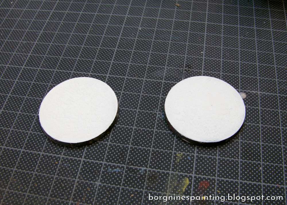
I start by painting the bases white. It's mostly to make the next step easier...
I start by painting the bases white. It's mostly to make the next step easier...
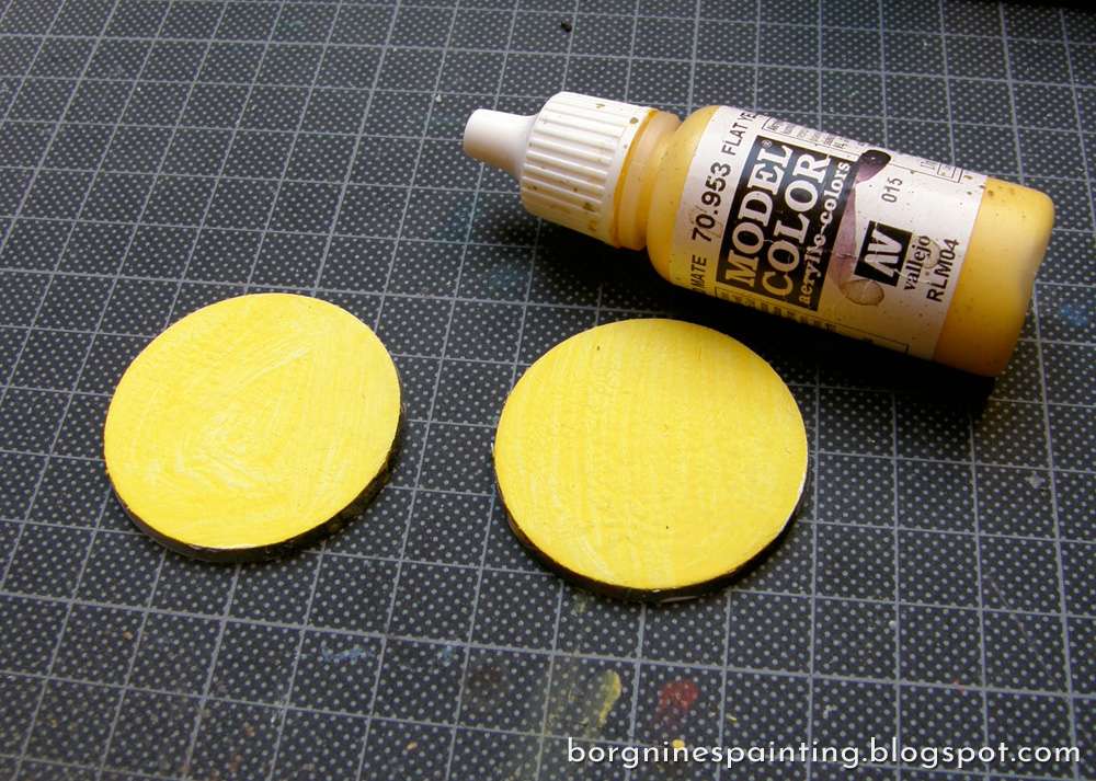
...which is painting them yellow. This color doesn't cover very well, so it works the best at the bottom layer.
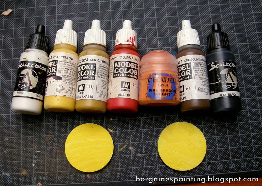
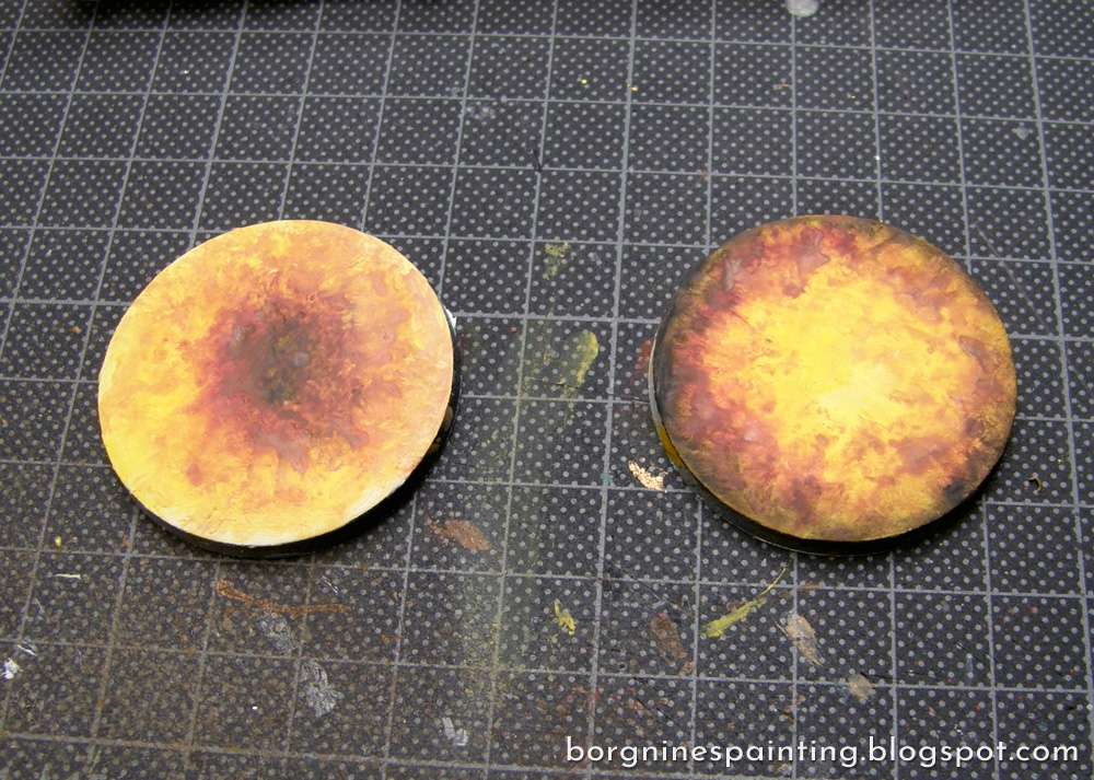
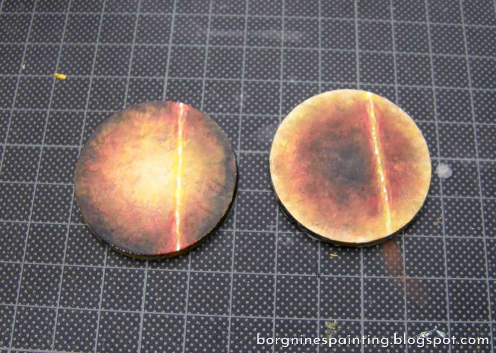
Now it's time for the lava colors themselves. I gathered some warm yellows, oranges, browns and reds, with some white and black for the extremes. The precise colors are not that important, but the general tone and range.
Then, using a fair amount of water, I began wetblending the lava image. It may sound daunting, but we are not going for smoothness or precision here - I start by doing a yellow center and a red outside, after which I mix some oranges in the middle, while dabbing a bit of brown and black on the outside, with some white in the middle. Here it how it looks during the painting.
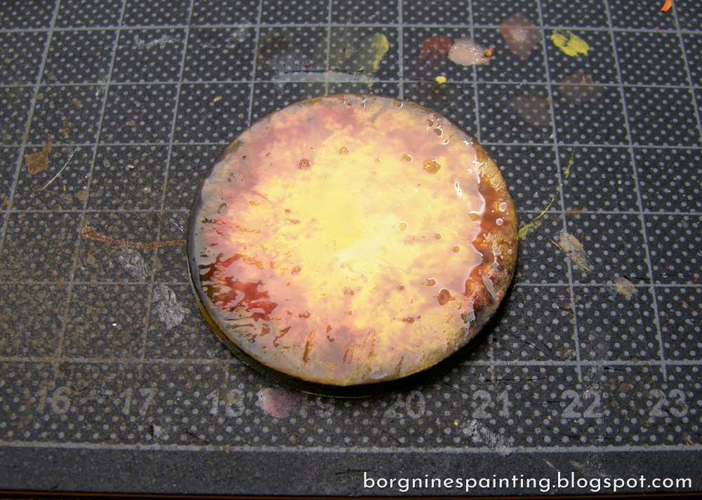
Here are my first layers. I didn't know which direction of the gradient I wanted, so decided to try them both out.
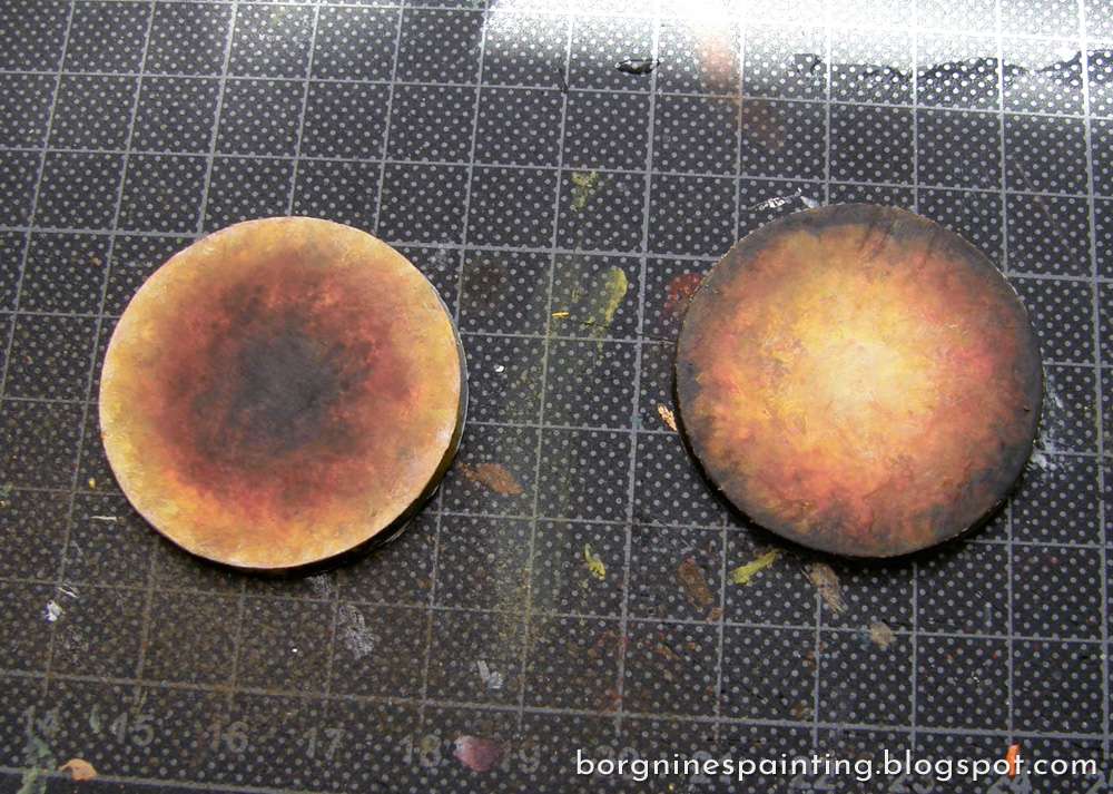
The colors were uneven after the first layer, so I did a went gradient again over them - if you are not satisfied with the work so far, you can just wait for this step to dry and try once again. Once there's some paints underneath, every next layer is easier and easier. If wentblending doesn't work, stippling various colors around the base would work too - even a bad gradient will work fine from the thin cracks of the finished piece.
Here are the bases after two coats:
Here are the bases after two coats:
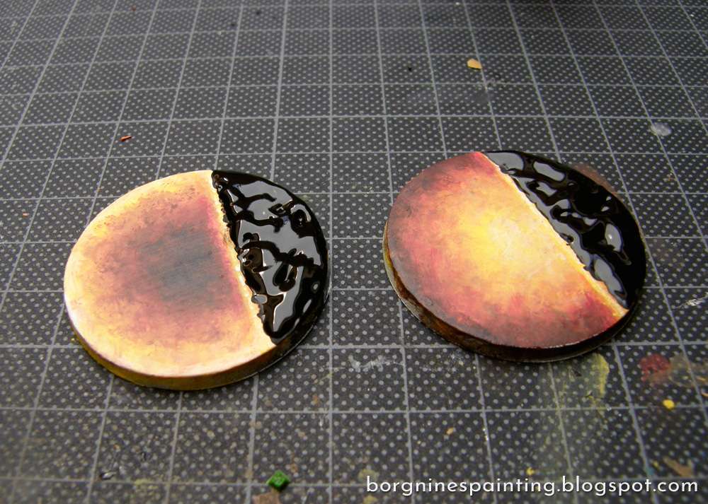
Then, the sporty lines. Just like with the bases themselves, I start with white.
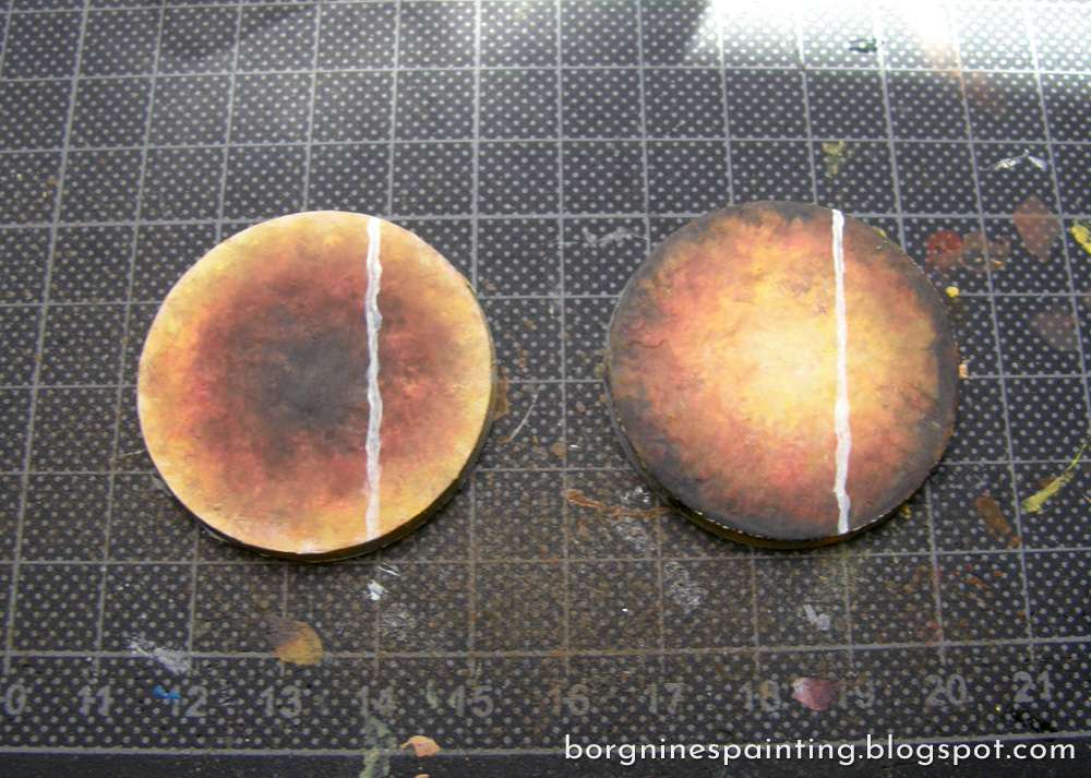
Followed by yellow, going somewhat outside the white line.
Now it's time to blend the lines a bit more - it's flowing lava after all. This part needs even less neatness. If the yellow line is on the yellow background, nothing needs to be done. If the yellow line is on the orange, then I add a bright orange between them. If it's on the red, then I add bright orange followed by dark orange. If it's on the brown, then orange and red - and so far. When that's done, I painted a thin, dotted line of white along the very middle of the line to make it look just a bit hotter.
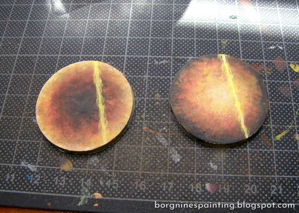
NOW, A VERY IMPORTANT PART:
Matt Varnish the lava image before proceeding! Crackle paints tend to pull on the paint when contracting, tearing the layers as it goes - I had to redo the whole process several times because of that...
After the Varnish is nice and done, it's time for crackle paint - I used Mordant Earth from GW, a completely black one.

And I applied it with a very thick layer (if you are unsure how thick, just know that it's better to do it too thick and too thin), going up to the middle of the line. When it contracts, it will move away from it, showing it completely, so no worries there.
And after it's dry.
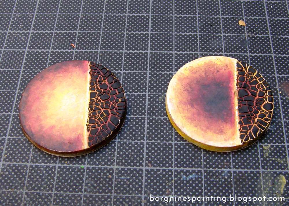
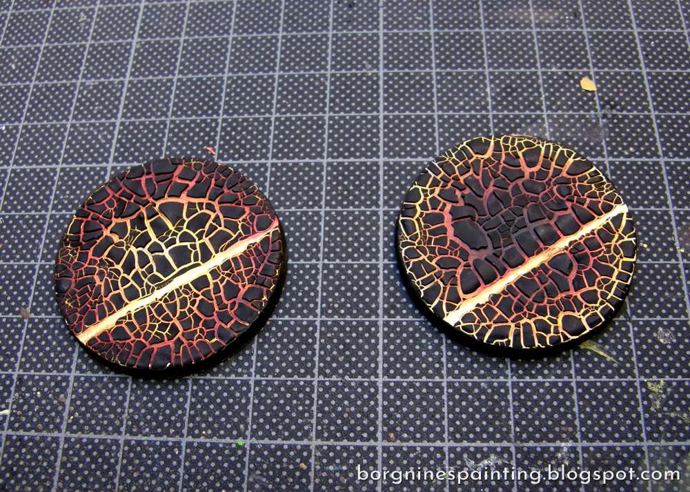
Then do the same thing for the other half - nd the whole thing is ready! The one on the left, hot in the center and cooling near the edges - and one on the right, inversed.
And this is how it looks with a mini on it (a random High Elf 'volunteered' to stand on the lava).
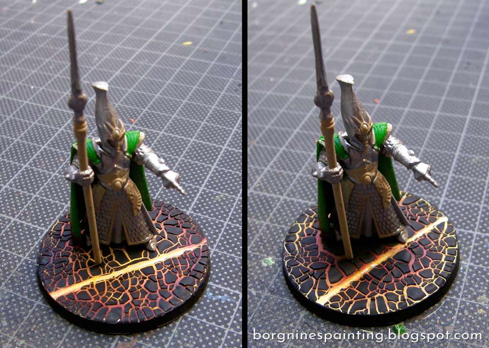
I decided to go with the right one on my minis - not only the cooler part in the middle gives an impression of a shadow underneath a model, the bright yellow edges look more striking against the base's rim.
Efekt końcowy powala. Bardziej podoba mi się z jasnym środkiem ;)
ReplyDeleteCieszę się, że się podoba, trochę musiałem się narobić zanim wyszło jak trzeba ;)
DeleteDzięki za tutka. Lava base'y to rzecz pożądana a nieprosta (bo crackle painty kapryśne, a varnishowanie - nieoczywiste). Mi też z jasnym środkiem bardziej.
ReplyDeleteDzięki ;) Teraz sam jestem niepewny i się zastanawiam nad wyborem odpowiedniego wariantu...
Delete